I would like to hear your opinions to the idea of choosing different colors for different kinds of rules.
The idea is to draw the markups for grammar and stylistic detections in different colors. I think the grammar rules detect real errors while the stylistic rules gives hints, that must not be errors at all. (For example, a repetition of words can be awful to a reader or can be used as a rhetorical effect.) Different colors help the author to decide between hard errors and weak hints.
Another category is what I call “week stylistic hints”. At the basis of SmartTags I wrote a little very easy LO extension. One of the rules deals with (German) filler words. I use a very soft color for markup, because there are very many matches. Everybody uses filler words and that is OK. But it is recommended for good texts to look at every such word, if you could delete it. To implement such a rule in LT is no good idea at the moment, because the whole text will be blue.
The idea is to define some categories, which contains rules whose results will be colored different from blue.
In the office extension it will not work by now. But I did a little patch to LibreOffice which was merged today. It allows to change the default color (and style) of a grammatic mark to an arbitrary value. It will be available since LT 6.2.
I like the idea.
It is possible to specify different colours for different types of error with the ‘errorColors’ setting. Refer to languagetool/CHANGES.txt at master · languagetool-org/languagetool · GitHub.
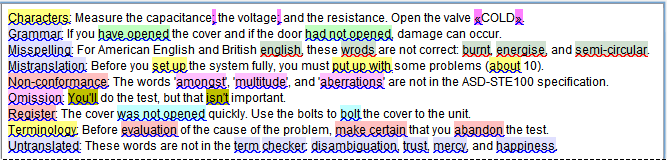
This is an example from the STE term checker:
LT could automatically add default colours to the configuration file.
I would rather have a severity level directed color.
how does one define severity?
(you could end-up with a document where the puns are highlighted as the most severe while the contextually wronger errors barely get recognition)
With the type-approach:
A. One already has a standard to follow.
B. One can appoint severity manually (and make it work with the story-setting/type)
Same about style versus other types of errors. How does one define and assign those?
I think you are missing the point.
severity depends on the context of the writing, making any weighing scheme worthless outside of a very specific situation. (and in large documents you may need to change the weighing-values multiple times … even if this could be automated, it could easily go horrendously wrong)
If type-of-error (something that LT already has partial support for as opposed to ‘severity’) is used as basis, then the user could self-appoint severity based on the whys.
I understand the discussion in that way, that most of you don’t like a fixed definition of different colors.
I like the idea to use the errorColors settings in the configuration file to set the colors in office extension. In that way the user could define his own weights between the categories by setting the color by himself.
The settings would be interpreted differently from the standalone version, because the extension would interpreted it as color of the underlining and not as a background color, but this doesn’t matter because the standalone and the office extension uses different configuration files.
Nice would be to have a possibility to set the colors by the option dialog.
Just I saw the errorColors deals with the ITSIssueType. Doesn’t it make more sense to orientate on the category names?
(Maybe I don’t understand the concept of the ITSIssueType.)
The category names in LT are the same as the values for the Localization Quality Issue Type.
When @danielnaber developed the errorColors method for me, he added some category names from the ITSIssueType (Internationalization Tag Set (ITS) Version 2.0 -- (Editors' copy)). “This will make integration of LT with other tools easier” Development Overview - LanguageTool Wiki).
Thanks for this patch. This is a really useful feature.
Grammar checkers should decide what colors to use, according to different kinds of mistakes, whatever their severity is or might be. It should be to the grammar checker to implement a dialog interface to modify the color used.
Please note that there is a bounty on a bug I filed last year: 105527 – [Bounty] Improve readability of grammar and spelling errors
And you did half of the job.
I also think we should have the possibility to use thicker line than the one-dot line. The reason is that, for instance, in French, we have a lot of mistakes on very small parts of text (one-letter word or two-characters typography mistakes), and it’s not easy to see them, as the wavy blue line is not thick enough.
I’d like to have the possibility to use a full straight 3-dots line. It doesn’t take more space than the one-dot wavy blue line, which is already 3-dots high, though one-dot thick.
I made tests with different kinds of thickness and colors to show how it improves the readability of mistakes:
https://bug-attachments.documentfoundation.org/attachment.cgi?id=130677
So is it possible to add different colors to different categories for web-page and browser add-ons?
We don’t have that feature yet (and frankly, it’s not on top of our to-do list).
Would it be ok to create an (low priority) issue on github?
@Fred:
Would you like claiming this bounty?
If you don’t, the money will be retained by Bountysource.
Edit: No, if you don’t, I’ll try to claim back the money and give it to a charity organization.
You did the most important part of the job. I just finished it.